Climate Graphs
Climate graphs are used to illustrate the average temperature and rainfall experienced at a particular place over the course of a year. The graphs consist of a red line graph showing average monthly temperature, and a simple column graph showing average monthly rainfall figures. Rainfall is, by tradition, shown in blue.
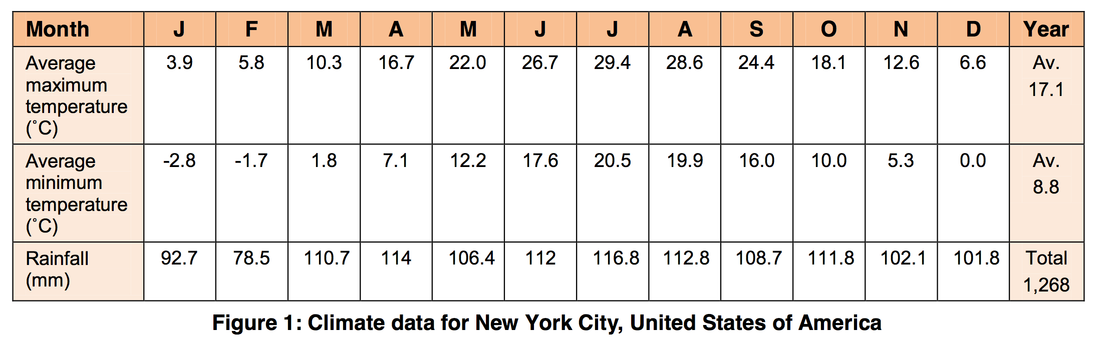
Some graphs show both the average daily high and low temperatures for each month. They do this by including two line graphs – the average monthly maximum temperature in red and the average monthly minimum in blue.
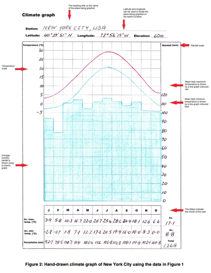
Look at the example below.
Some graphs show both the average daily high and low temperatures for each month. They do this by including two line graphs – the average monthly maximum temperature in red and the average monthly minimum in blue.
Look at the example below.
The websites of the following organisations can be used to locate climate data for a city of your choice.
Constructing a Climate Graph
To construct a climate graph, use the climate graph template and follow the steps below.
- Select a data source. You can find climate data on the world climate websites mentioned above.
- Transfer the temperature and rainfall data from your data source into the table at the base of the climate graph.
- Locate the wettest month and the months with the highest and lowest temperatures. Use this information to add a suitable scale for both temperature and precipitation (rainfall). Place temperature scale on the graph's left-hand axis and rainfall on the right-hand axis.
- Plot the rainfall figures. Then colour the columns blue.
- Plot the average maximum and minimum temperature data, making sure each dot is placed in the centre of the month. Use a red pen or pencil to join the points plotted for the average maximum temperature with a smooth, red curve. Use blue for the line joining the points marking the lowest monthly temperature.
- Add a heading that includes the name of the place being graphed and its latitude, longitude and elevation.
Activities
- Access the HKO website at http://www.hko.gov.hk/cis/climat_e.htm long-term climate data for the station closest to Hong Kong. Use this data to construct a climate graph. Compare the climate of the place in which you live with that of New York.
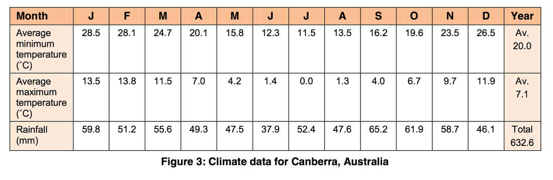
- Construct climate graphs for EITHER Calcutta (in India) or Canberra (in Australia). The data for Calcutta can be accessed at the World Climate <http://www.climate-charts.com/> website. The data for Canberra is provided below. Compare the climate of Hong Kong to either Calcutta or Canberra.
- Use one of the world climate websites to find climate data for a city of your choice. Use this data to construct a climate graph.
*** Activities and information on this page is from GEOGSpace, the Australian Geography Teachers Association
